Quick Links -
Portfolio - Current About MeSettings -
Stars -
Individual Pages -
GT Exhibition
Three.js 3-4 Three.js 3-5Graphic Design
Florida Postcard Wisconsin Postcard Poured Paint Ornament Flyer Trash Panda Menu Split Complementary Seal GT Exhibition Flyer Monochromatic Seal Orchestra Program Cover Game Night FlyerMisc. Pages
Credits Contact
3-4 Basic Movement
First main attempt of making movement in Three.js, technically my 4th attempt in 3d, thus its 3-4. Very meh, lots of issues but a decent base to build off of.
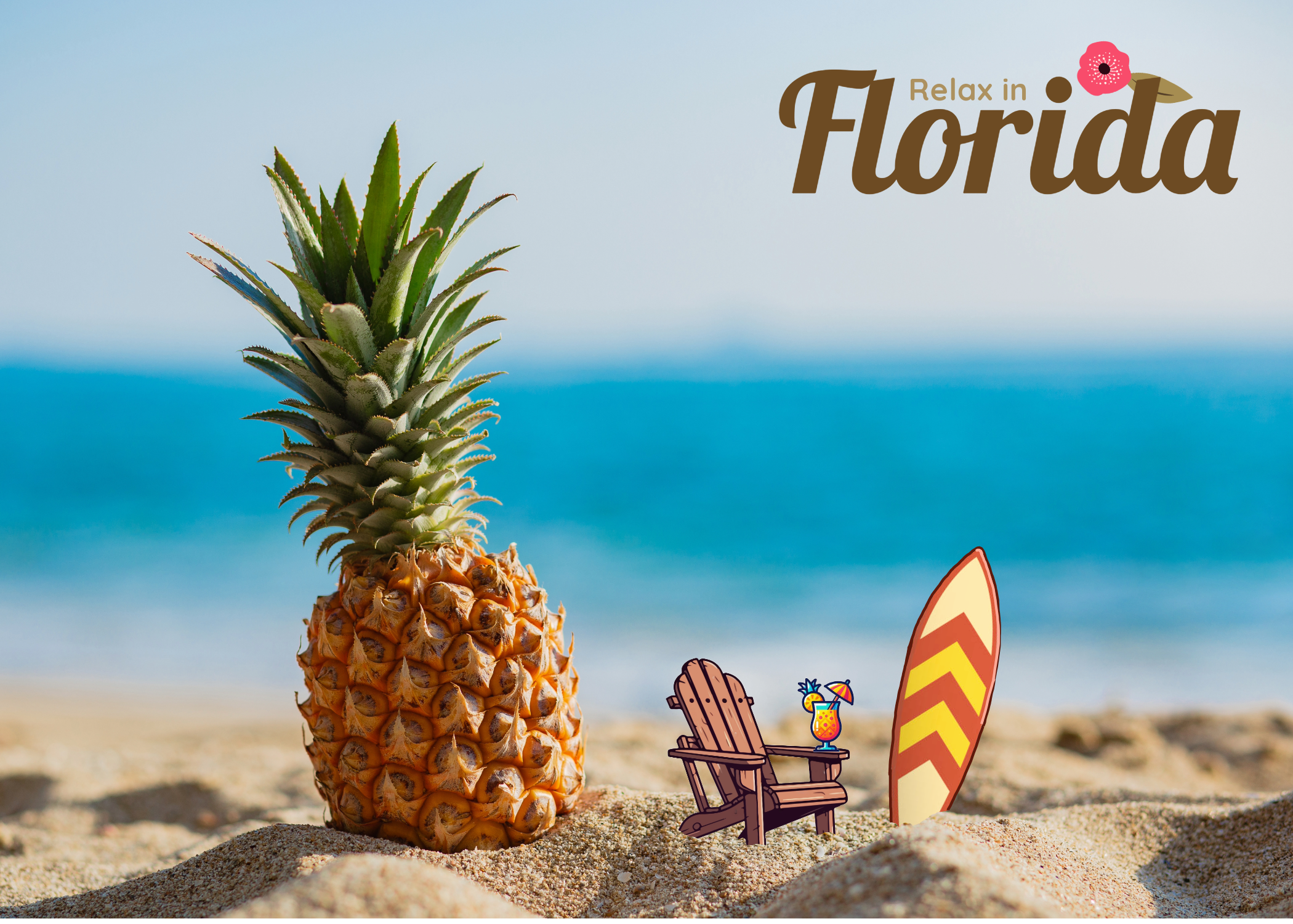

Florida Postcard
There was no client for this design. Rather, it was an assignment on repetition. I tried my best to keep a similar theme of pinapples throughout the work. I also tried to keep the color palettes relatively similar between both pages.


Wisconsin Postcard
Part of the same assignment as the florida postcard. The goal was to emphasize repetition between both pages. I tried to keep the idea of cheese as forefront as possible. I also attempted to use similar color palettes.
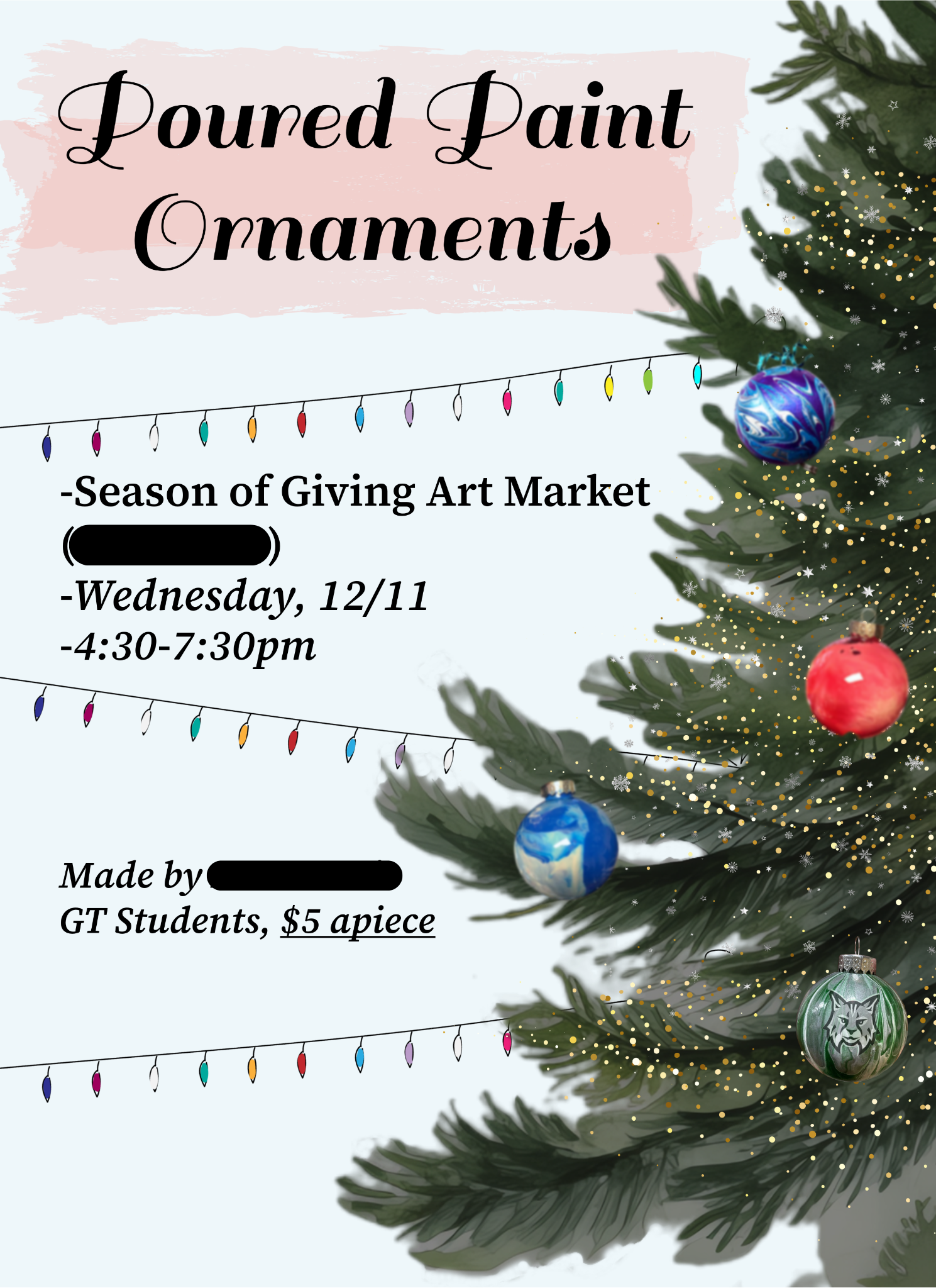
Poured Paint Ornament Flyer
Our client this time was Ms. Reese the GT teacher. Our goal was to premote the ornaments her class was selling. I worked in a partnership on this project but I the main design lead. We tried to really focus on alignment for this commission.
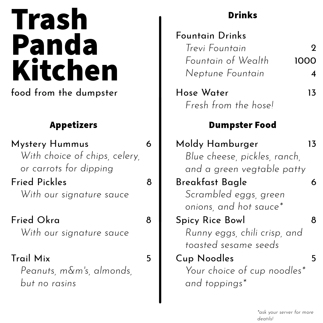
Trash Panda Menu
There was no client for this graphic design. It was an assignment about proximity. The goal was to create a menu using groups of objects to create proximity while not crowding the design. I used a very minimalist structure and a black and white color palette to help avoid clutter.

3-5 Better Movement
Much smoother movement and now with jumping and crouching! Yippee! Used 3-4 as a base so it looks the same but this one is better I swear. Still need collision detection though :|

GT Exhibition Flyer
This, like the ornaments, was another commission for Ms. Reese an dit was also a partner project. It was for promoting the upcomming GT Exhibition. There were many requirements to meet so we tried to keep the colors simple as to not overclutter. The main thing we focused on was alignment, specifically in a circle.
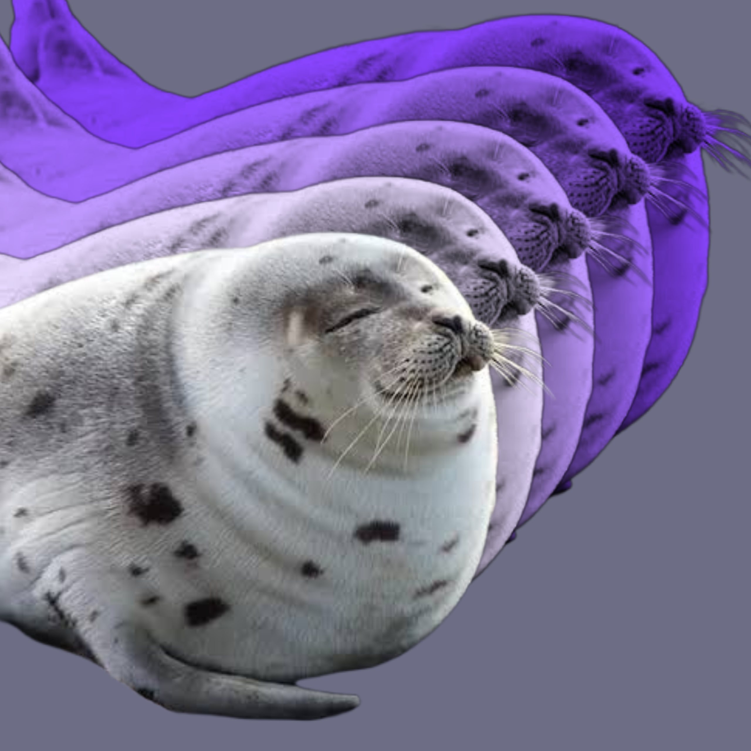
Monochromatic Seal
There wasn't a client for this design. It was an assignment about utilizing a monochromatic color palette. I chose a purple for my base color as I thought is looked quite nice. I also used a neutral gray-blue background to not interfere with the color palette.
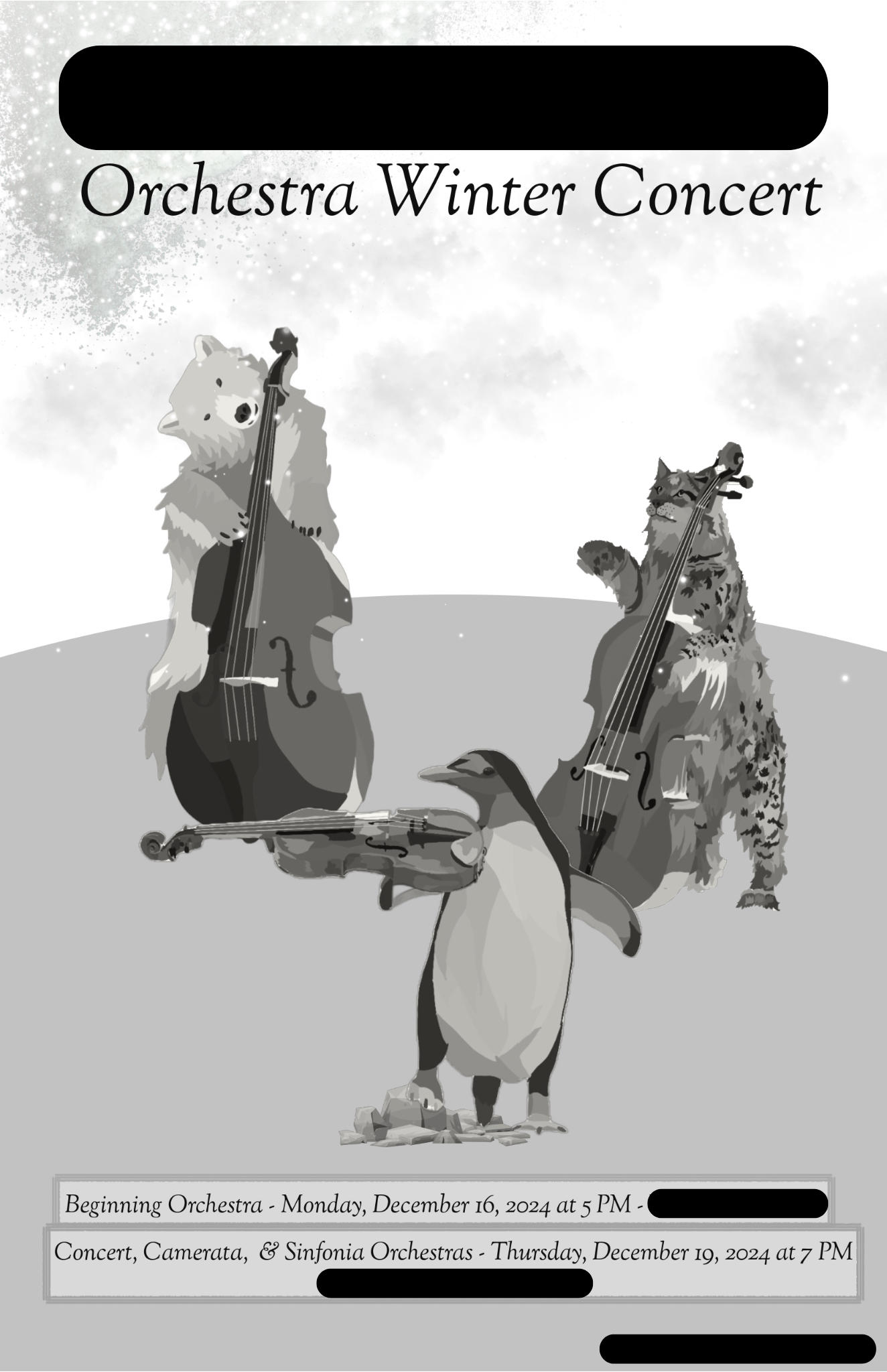
Orchestra Program Cover
This was a commission for Ms. Compton and also a partner project. It was an orchestra program for the winter concerts. It also had to be black and white which added a level of challenge. The thing we focused most on was proximity as to keep things neat and organized.

Game Night Flyer
There was no client for this design. This was insted an assignment about alignment. I tried to align everything by an imaginary outside line. I also tried to incorperate a monochromatic color palette.
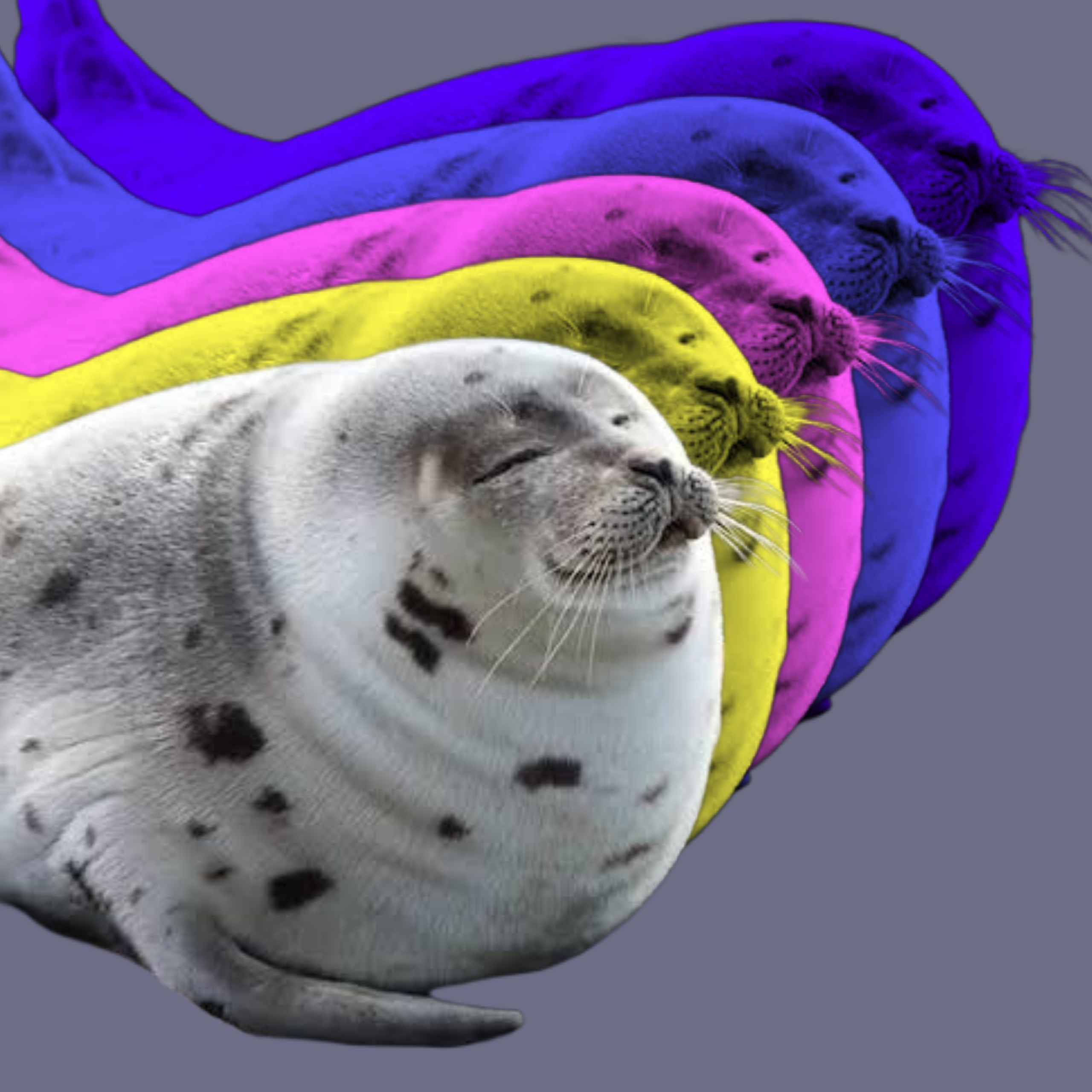
Split Complementary Seal
There was no client for this design. This time it was about utilizing a split complementary color palette. I chose yellow, pink, and blue-purple to achieve this. I also used a neutral gray-blue background to not interfere with the color palette.
